Intro
Timeline: 6 months. Materials: Sticky Notes, Pen, Paper, Sketch, InVision, Photoshop, Illustrator. Team size: 3 UX/UI designers.
UX Techniques Used: Customer Journey Mapping, User Personas, Site Map, User Flows, Wireframing, Prototyping, Usability Testing, Remote Testing, Focus Groups..
Brief
To re-design the existing Heineken Direct B2B Hybris website improving UX, acquisition, retention, conversion and content.
Heineken Direct have ambitions to increase online transactions from 40% to 70% of their customer base, this would make a step-change in their online business as the current site transacts around £350m per year. While the current sites conversion rate was high (around 40%), adoption and retention was low, and converting new users to repeat purchasers was a challenge and needed addressing with a root and branch approach fully understand what considerations users have when it comes to selecting a drinks supplier.
Approach/Methodology
After identifying the 'steel thread' user journeys we focussed our attention on these key routes. Testing with users along the way, tweaking the language, designs and journeys with each iteration. We discovered 3 key routes to purchase:
1. Home › Order Templates › Checkout
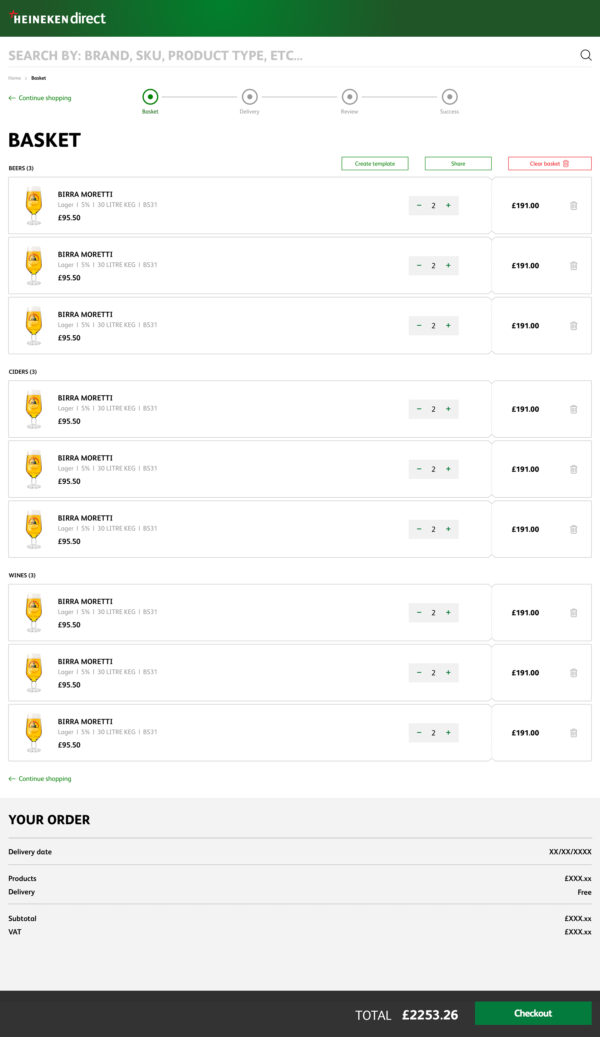
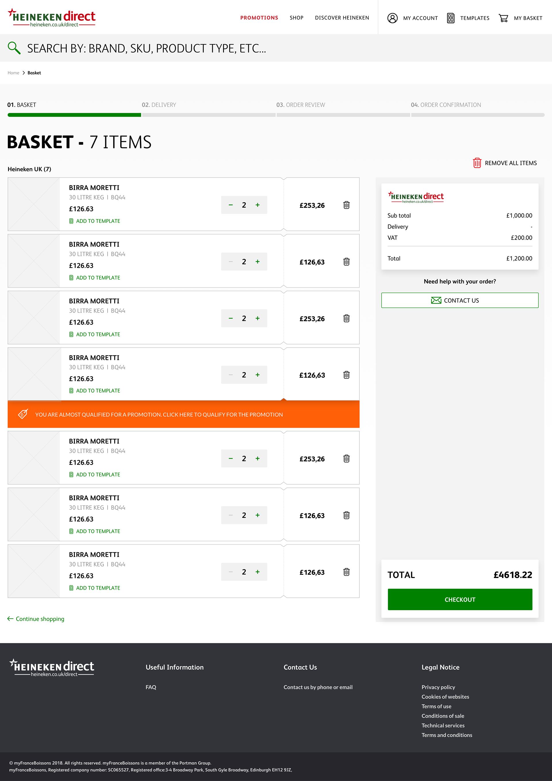
2. Home › Search › Basket › Checkout
3. Home › Product lists › Basket › Checkout
The difference between these journeys and what you would see on a traditional B2C website is that the users used Order Templates and the Basket as a way to build up their order over a number of days before checking out, usually on a Monday morning after a busy weekend.
Customers are contractually obliged to delivery dates but can select off-day deliveries at a premium, so making sure they don't miss the delivery cutoff point was a key factor to avoid customer frustration and expense.
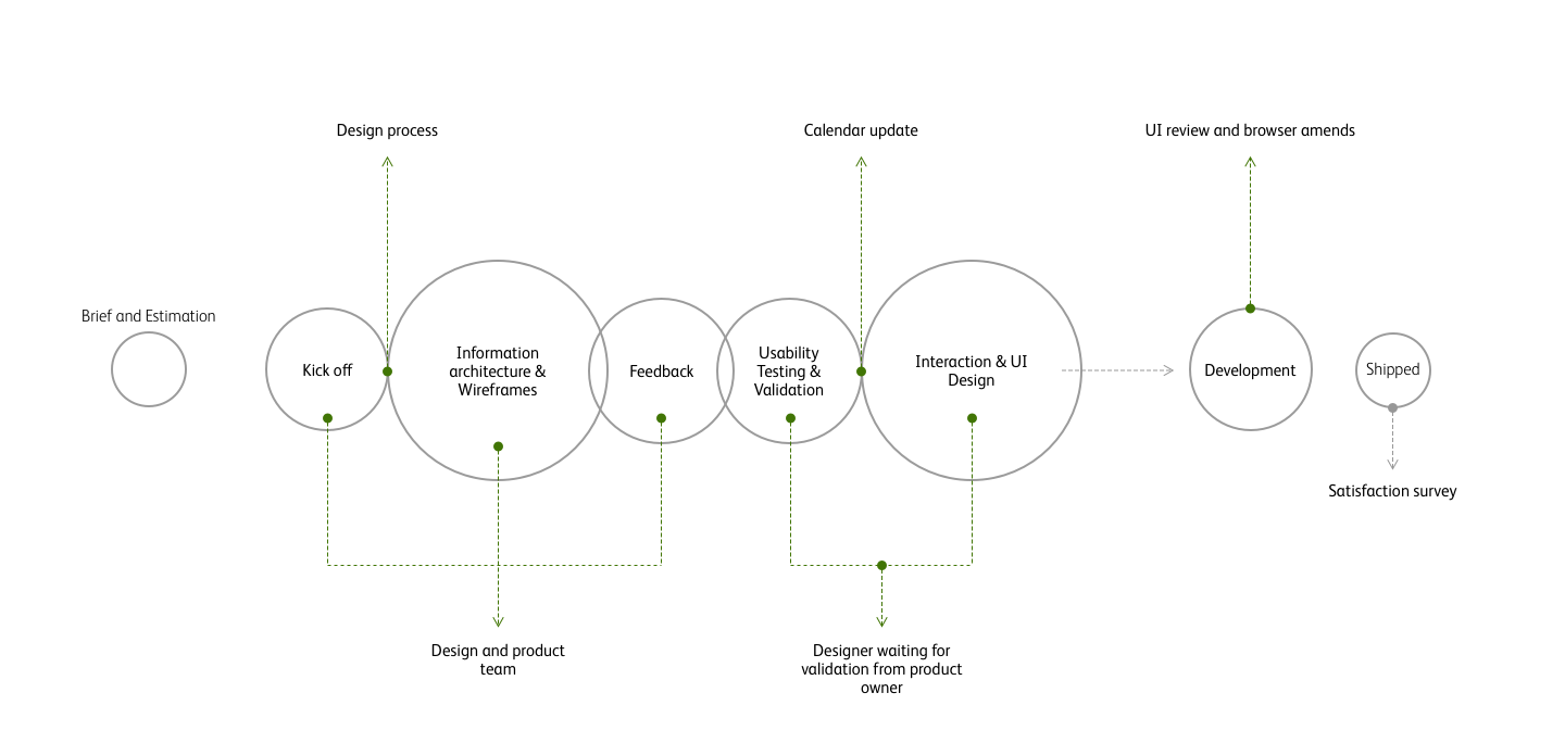
Process / Ways of working
While the majority of transactions and visits occurred on desktop, mobile use remained consistent and converted well, while tablet adoption and conversion was low. This was one of the first things we needed to address - make the site device and browser agnostic and streamline the handheld experience.
Defining scaleable column based grids and flexible breakpoints on a robust framework helped solve many of the UX issues we witnessed in user testing and through remote recordings.
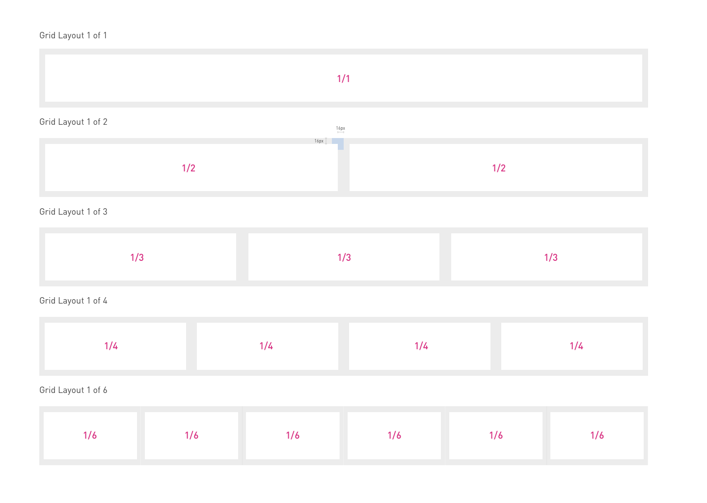
Desktop column grid
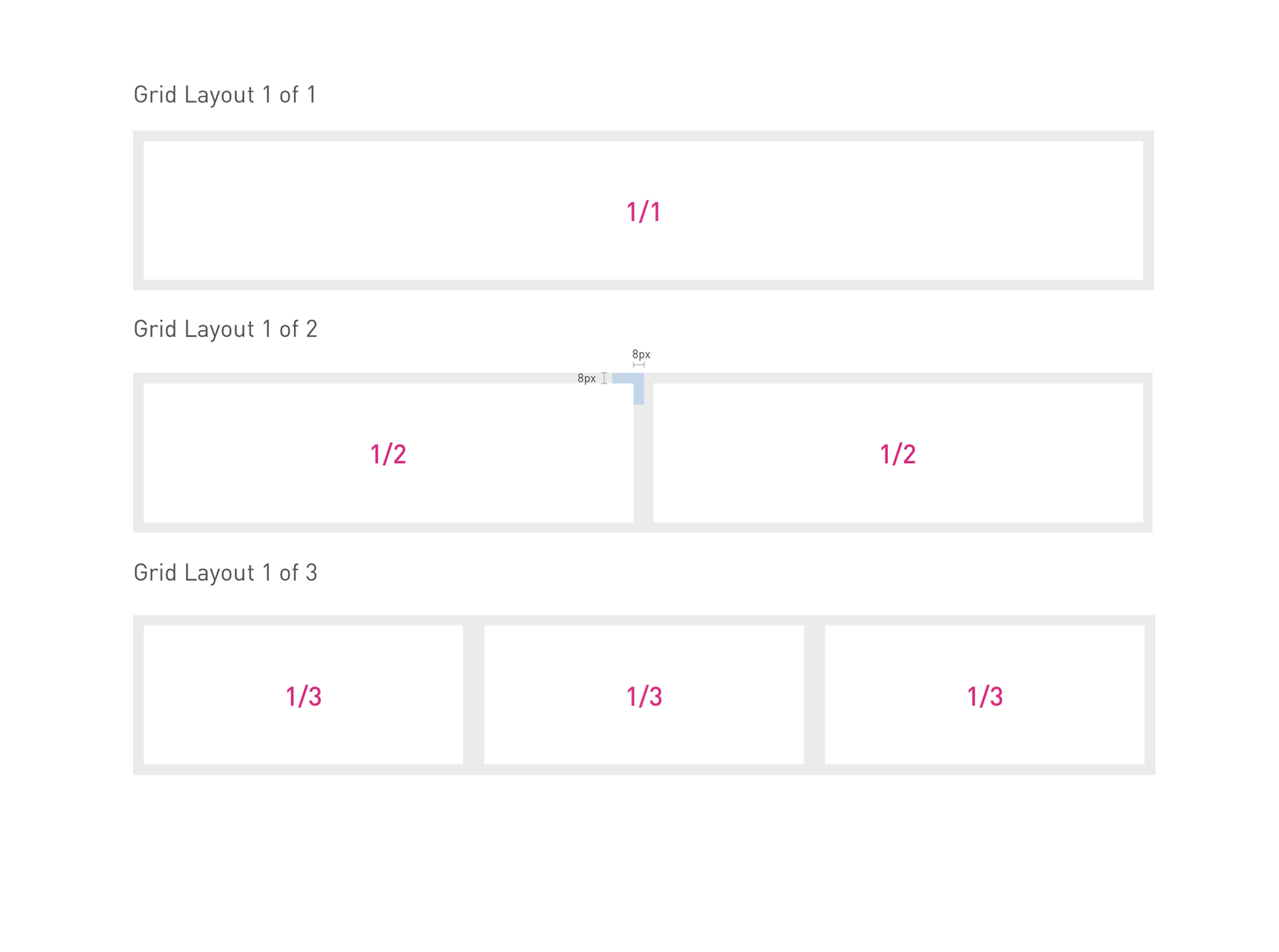
Mobile column grid
12 column, 8 pixel grid
Users Hierarchy of Needs
Once a foundation of functionality, reliability, and usability are achieved, delight can be pursued.
There are two types of delight that users may experience when they interact with an interface: surface delight and deep delight.
1. Surface delight is local and contextual; it is usually derived from largely isolated interface features.
2. Deep delight is holistic, and is achieved once all user needs are met, including functionality, reliability, usability, and pleasurability. Users may have a poor experience on a site, and yet feel surface delight occasionally.
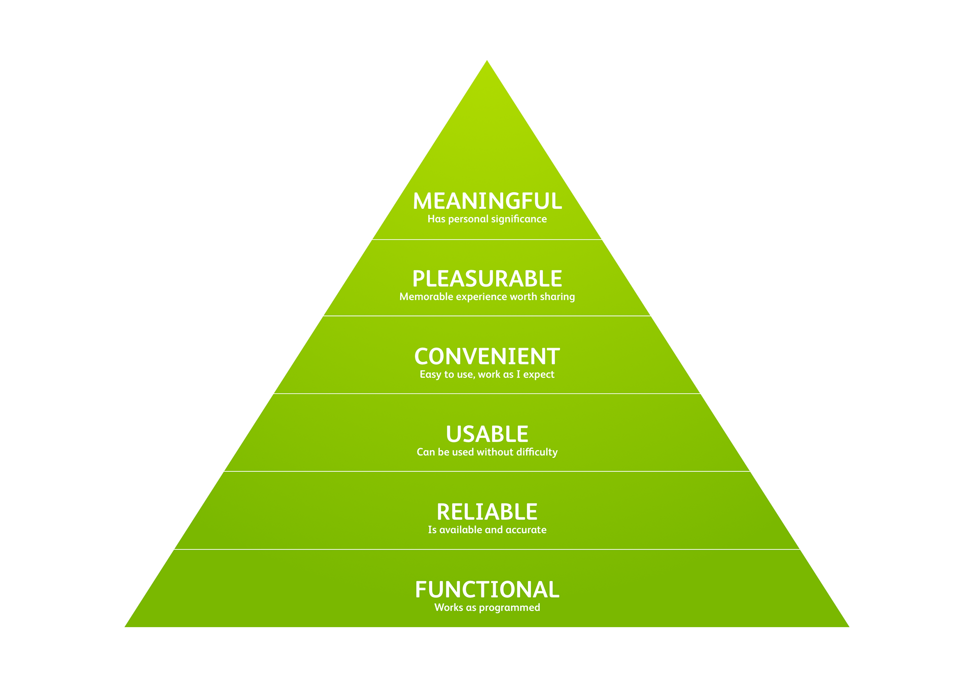
Users hierarchy of needs
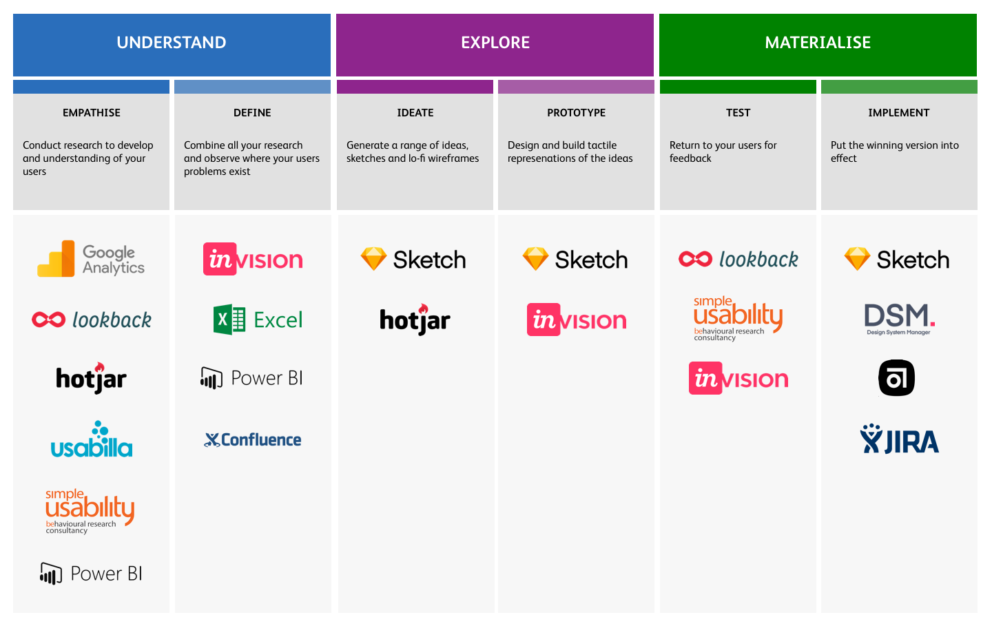
Toolkit
User personas
Having a representation of the Heineken Direct key audience segments for reference is pivotal to understanding their needs and expectations. We held workshops with a range of real users to captured their behaviours and how they use the site, and what gaps there might be in the current functionality. The mix is varied from small country pub owners to large multi-outlet publicans.
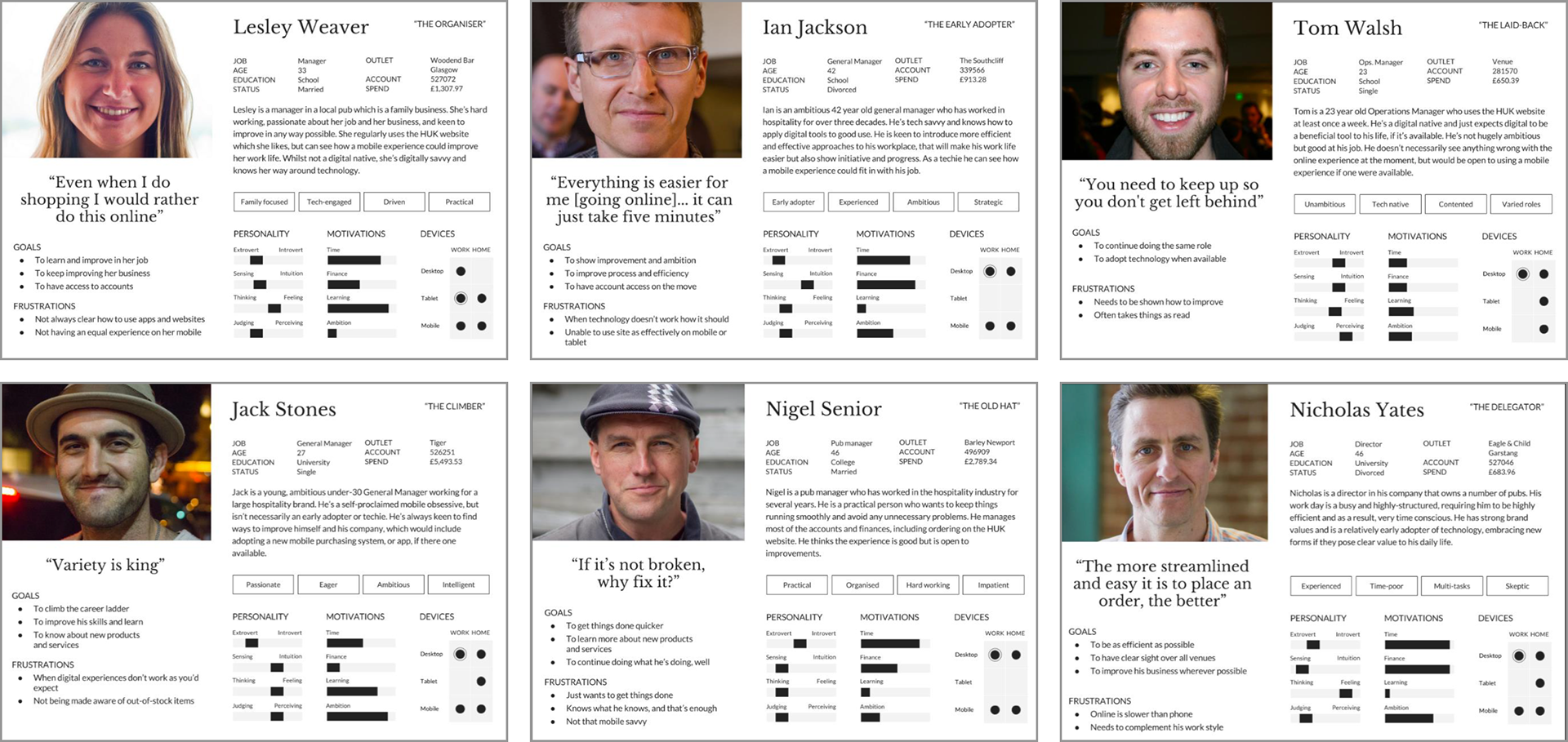
User Persona examples
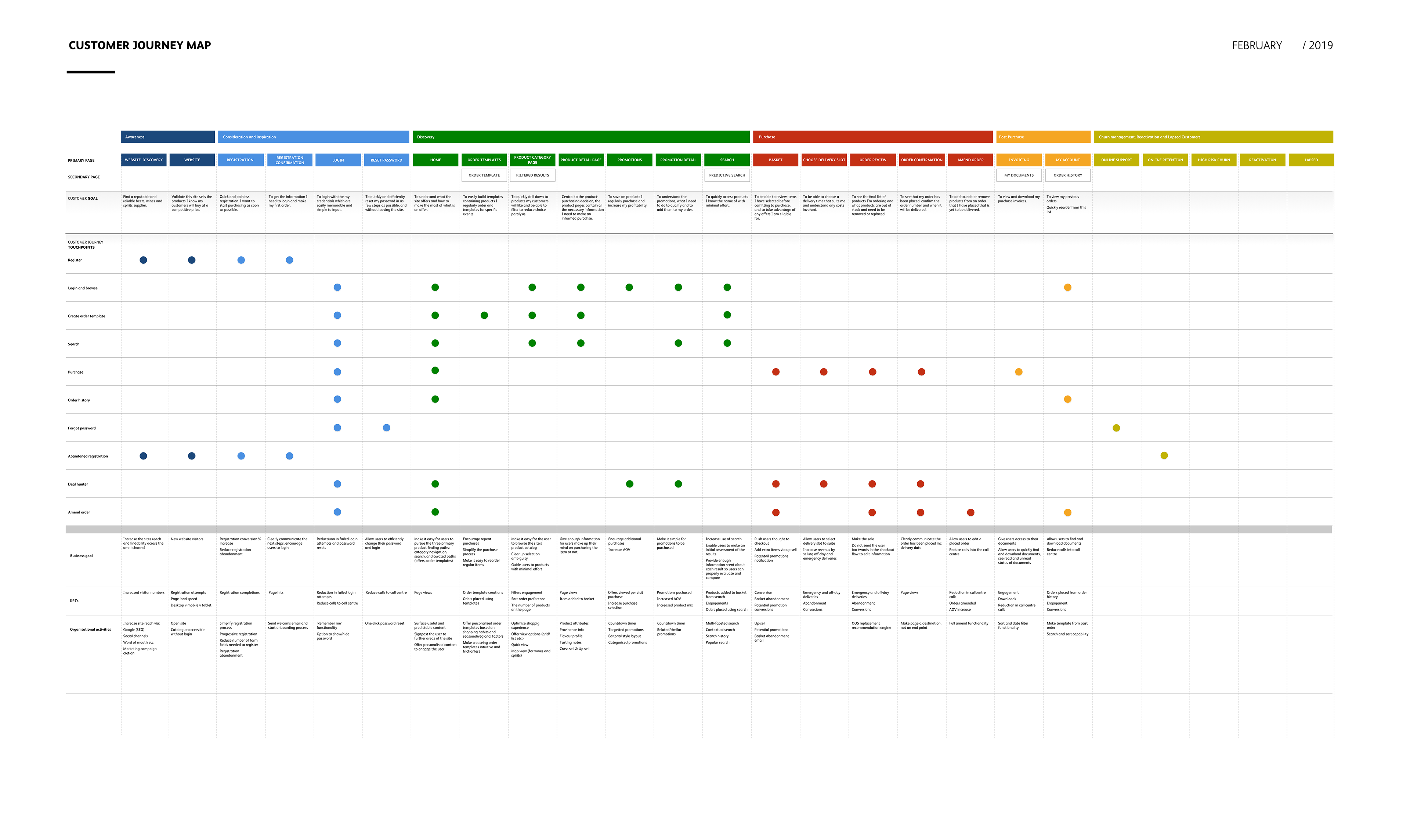
Customer Journey Map
User journeys
Journeys varied because of several factors, such as outlet type, age, new vs existing customers, AOV etc. Plotting these against user personas helps identify bottle necks in key purchase, acquisition and retention journeys and highlight users specific needs and habits.
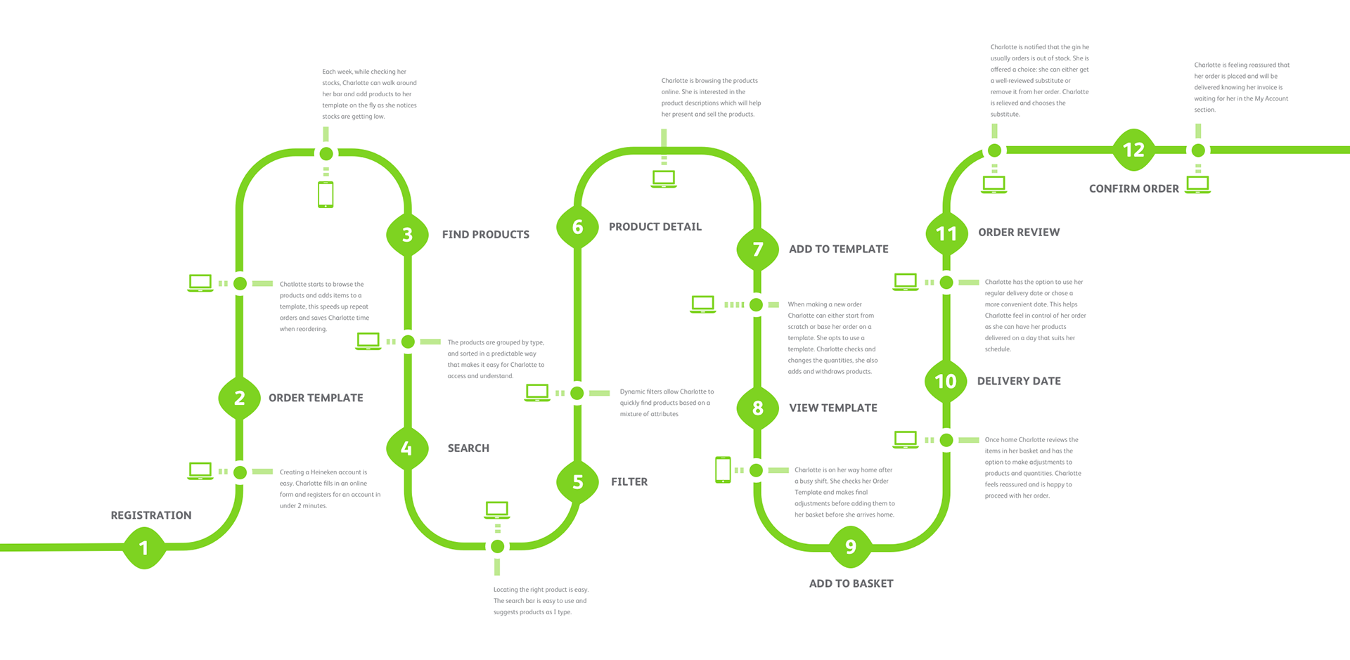
User Journey example
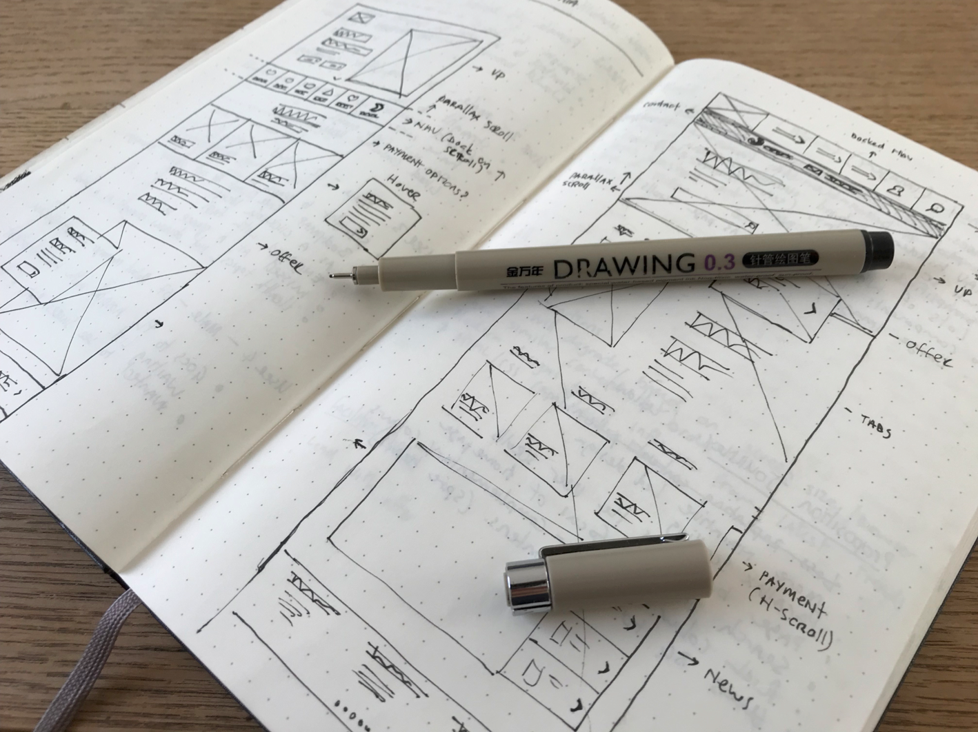
Wireframes
Starting with pen and paper we began to form wireframes of the page templates and key components. Using cognitive behaviours we observed in user testing, qualitative data from Hotjar and quantitive data from Google Analytics and SAP we were able to piece together the key areas of interest to our user groups.
Customer type registration wireframe
Design library and system
Adding the creative layer was simplified and streamlined with the help of an Atomic Design System. This meant building up a collaborative library of design assets to facilitate the transformation of the wireframes into polished designs, with the reassurance of inherent consistency. Guidelines for each element were documented to ensure correct usage and to avoid ambiguity during the build process.
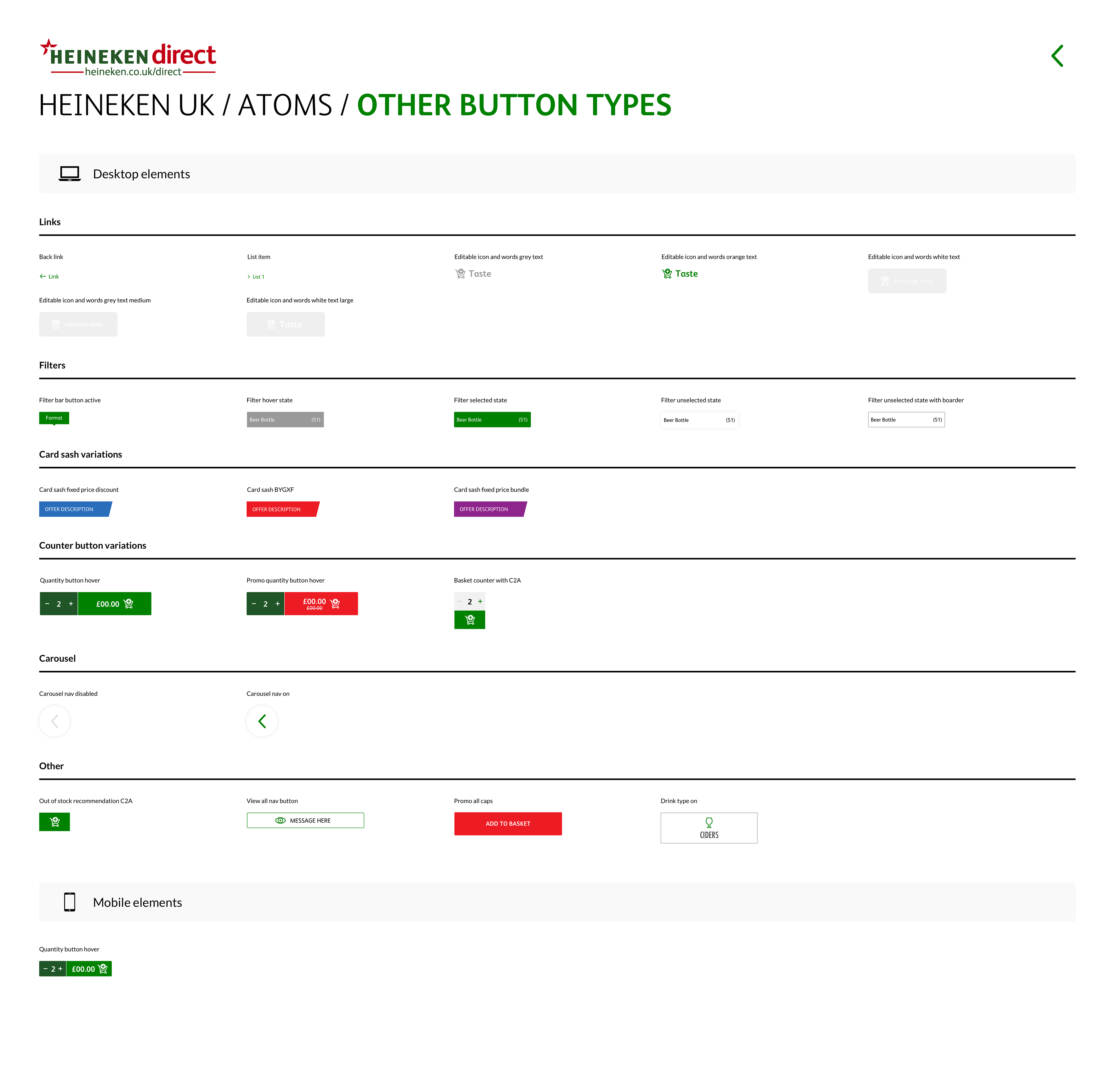
Non-core button library items
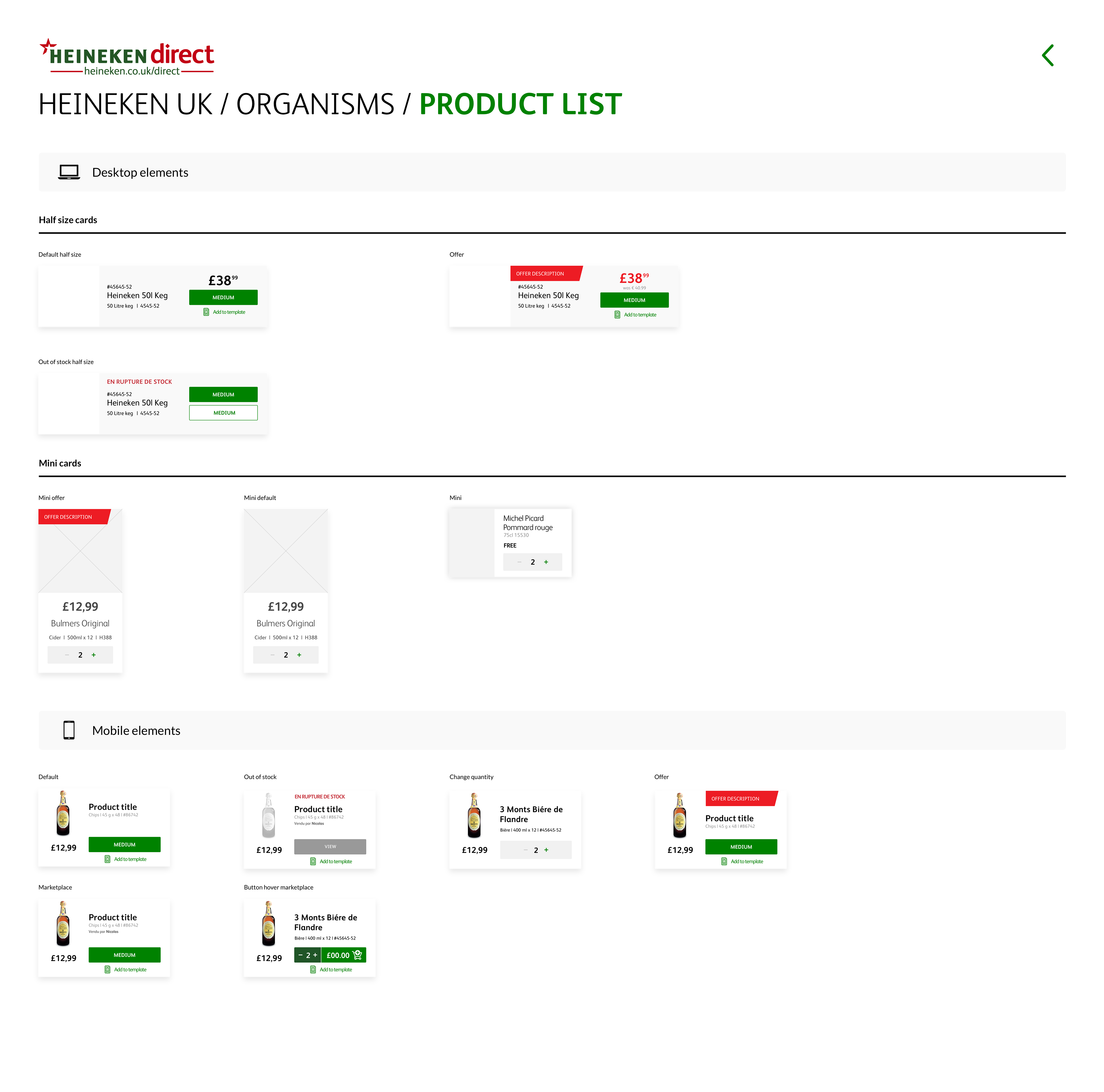
Product list library items
Navigation library items
Product cards library items
Spacing guide example
Components


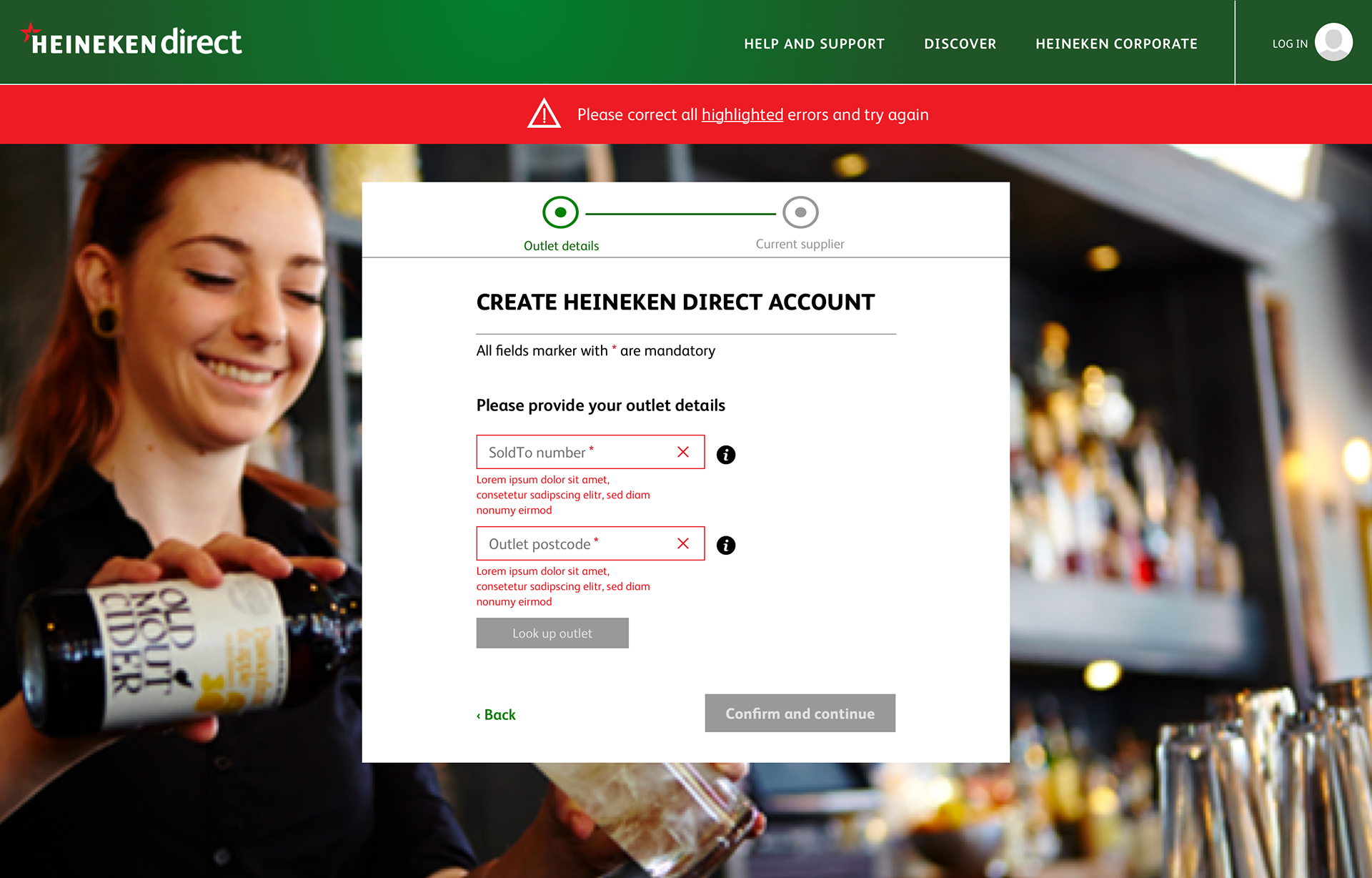
PROGRESSIVE DISCLOSURE REGISTRATION
This means only the necessary or requested information is displayed at any given time. Show only the most important options up front. Prioritise those options according to user’s needs and expectations. Offer a larger set of specialized options on request; disclose additional features /info only if the user asks for them or needs them.
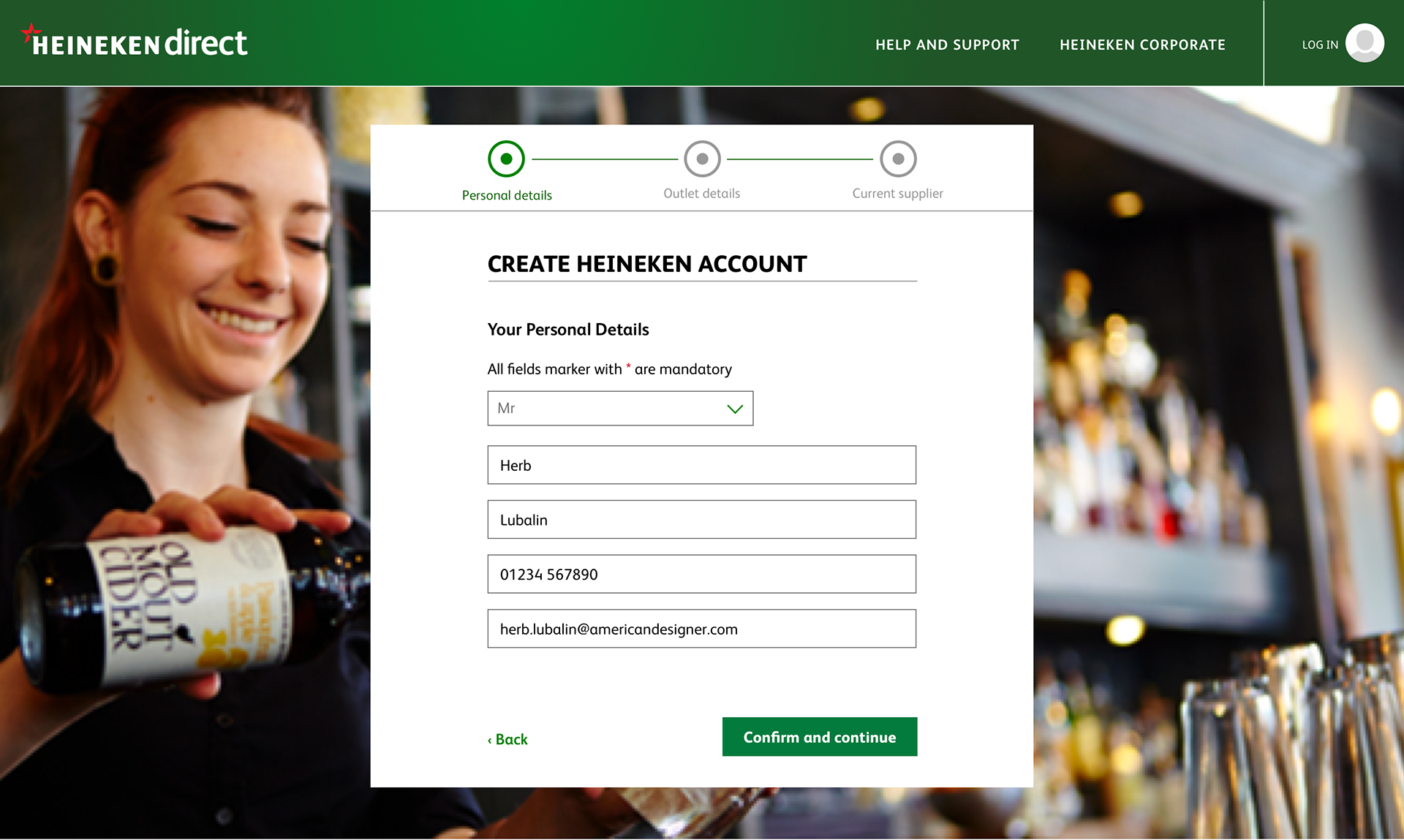

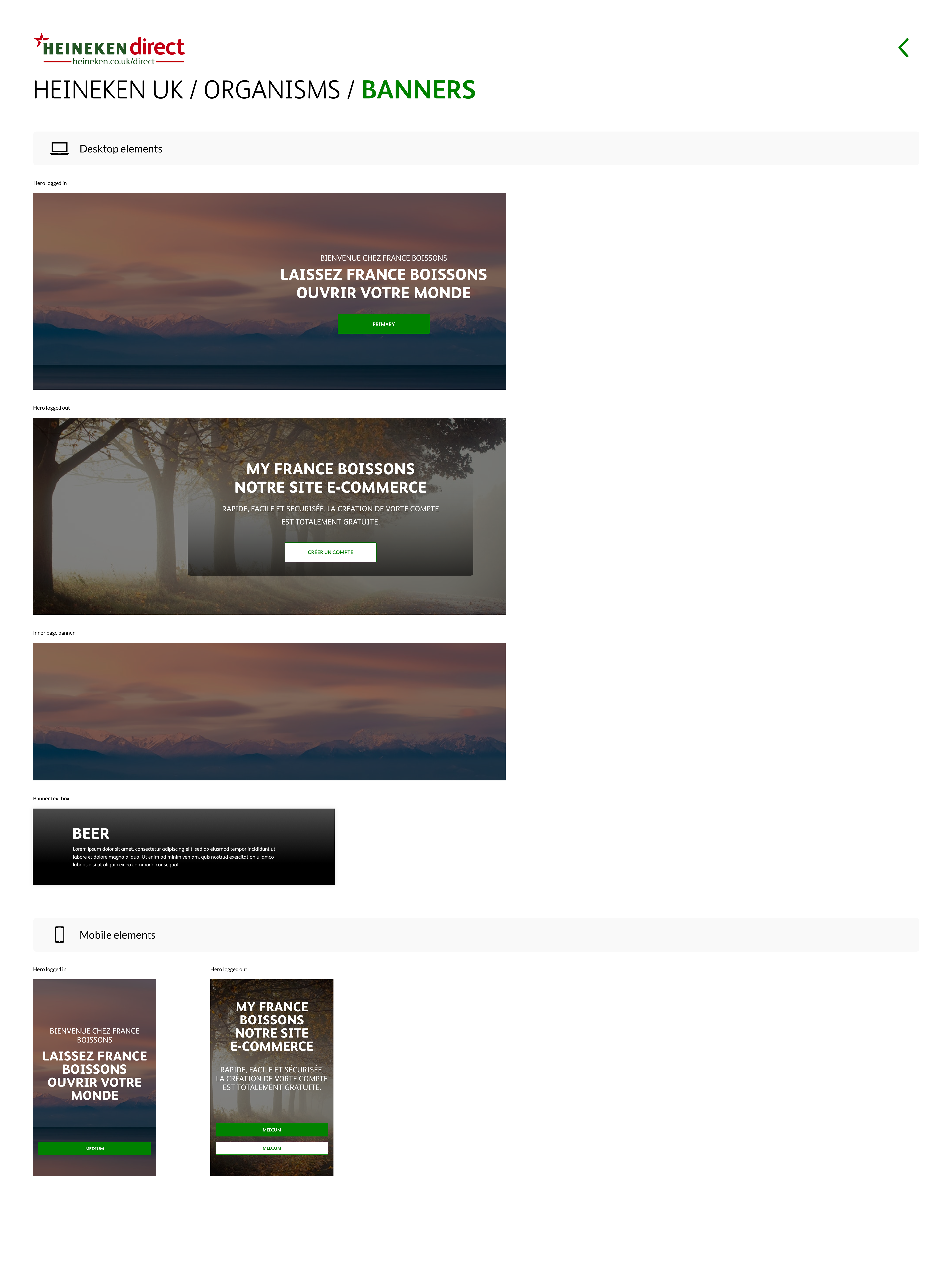
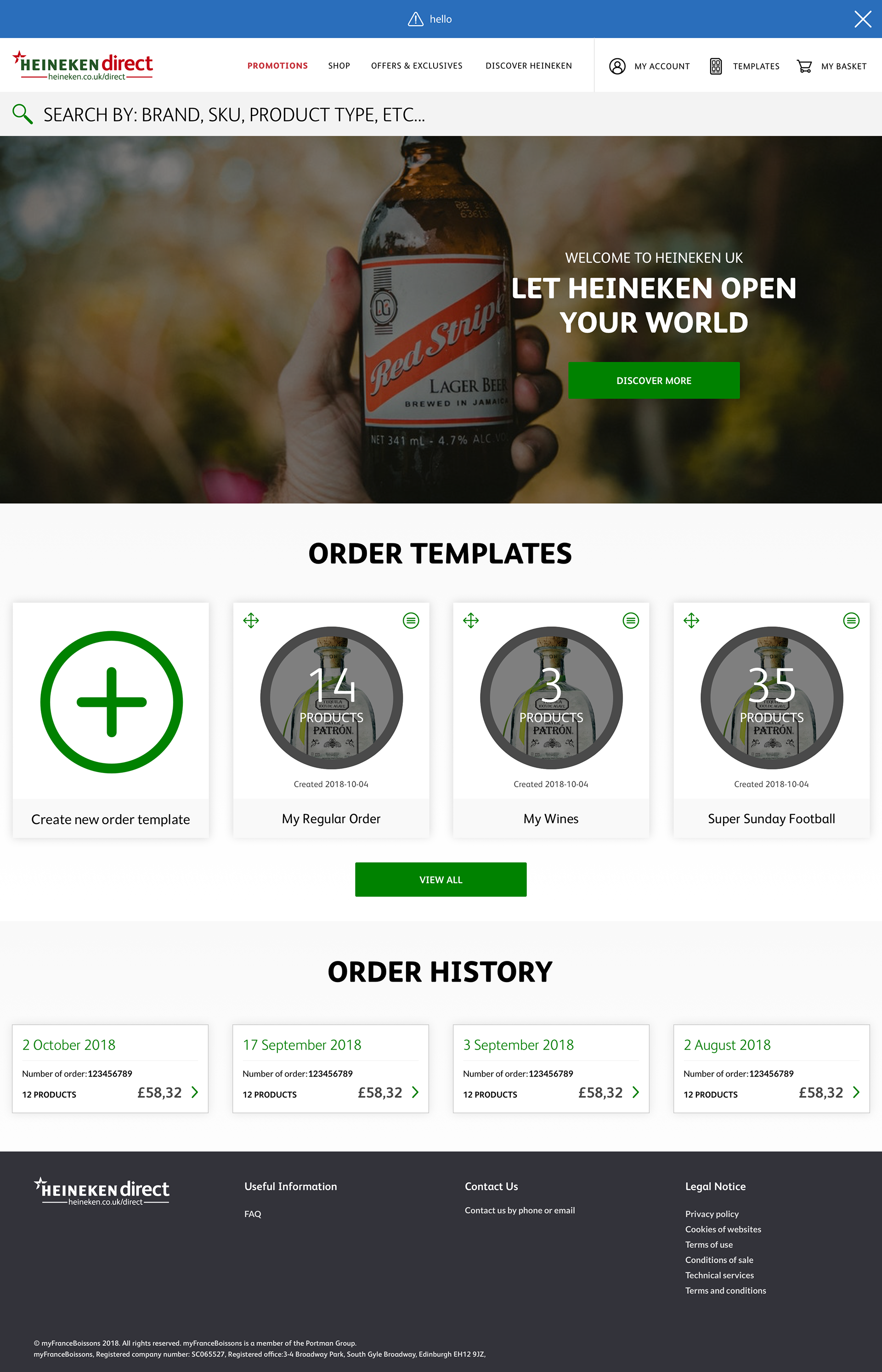
Home page - Logged out
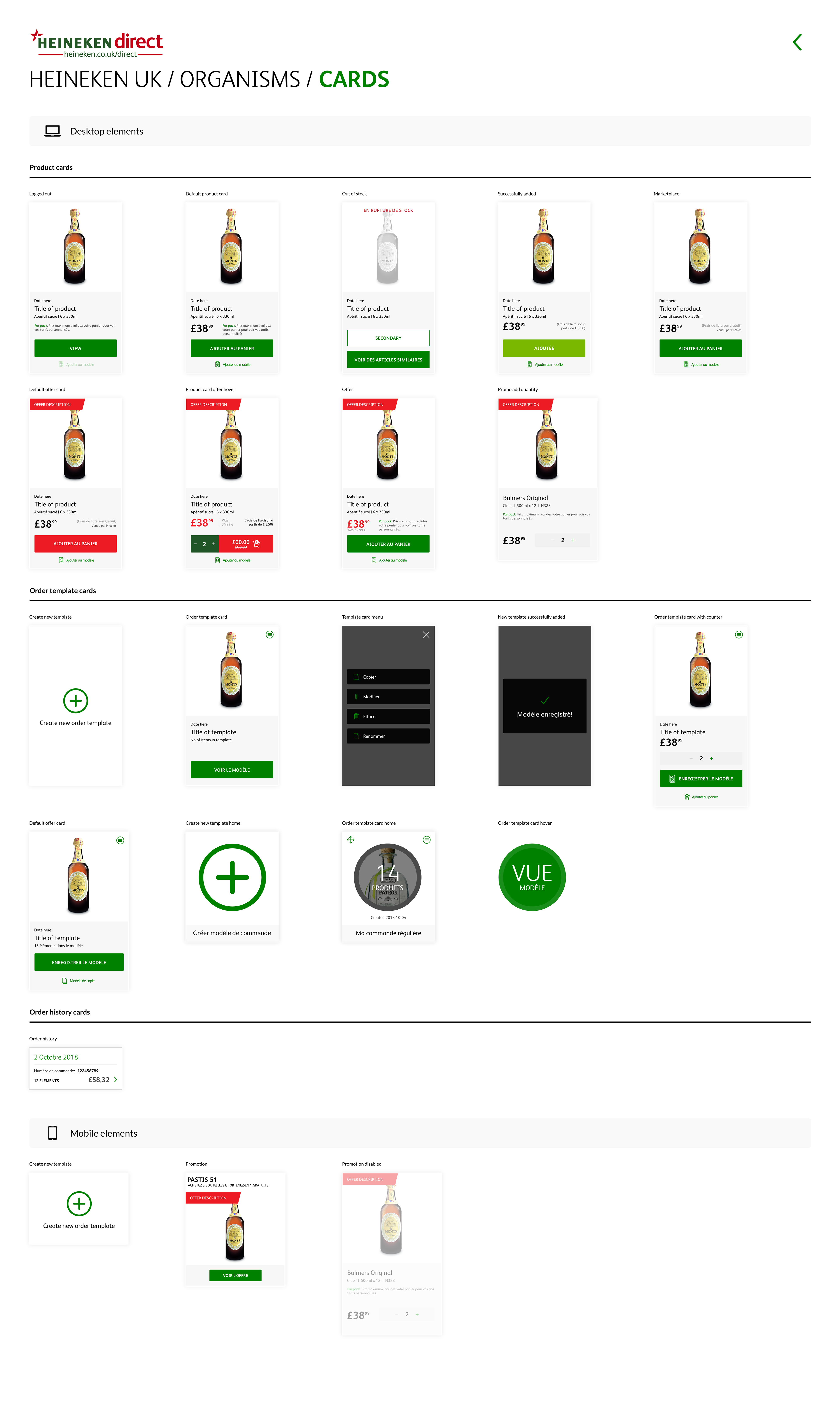
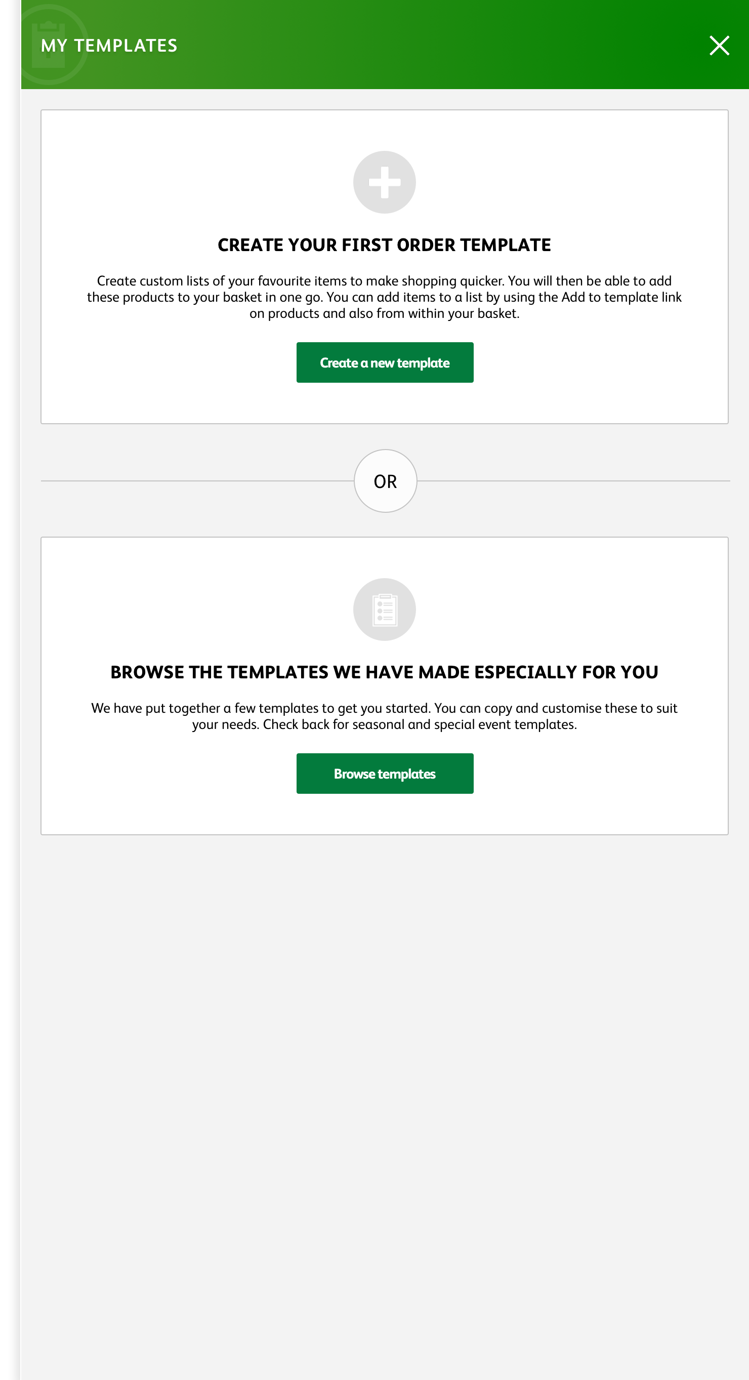
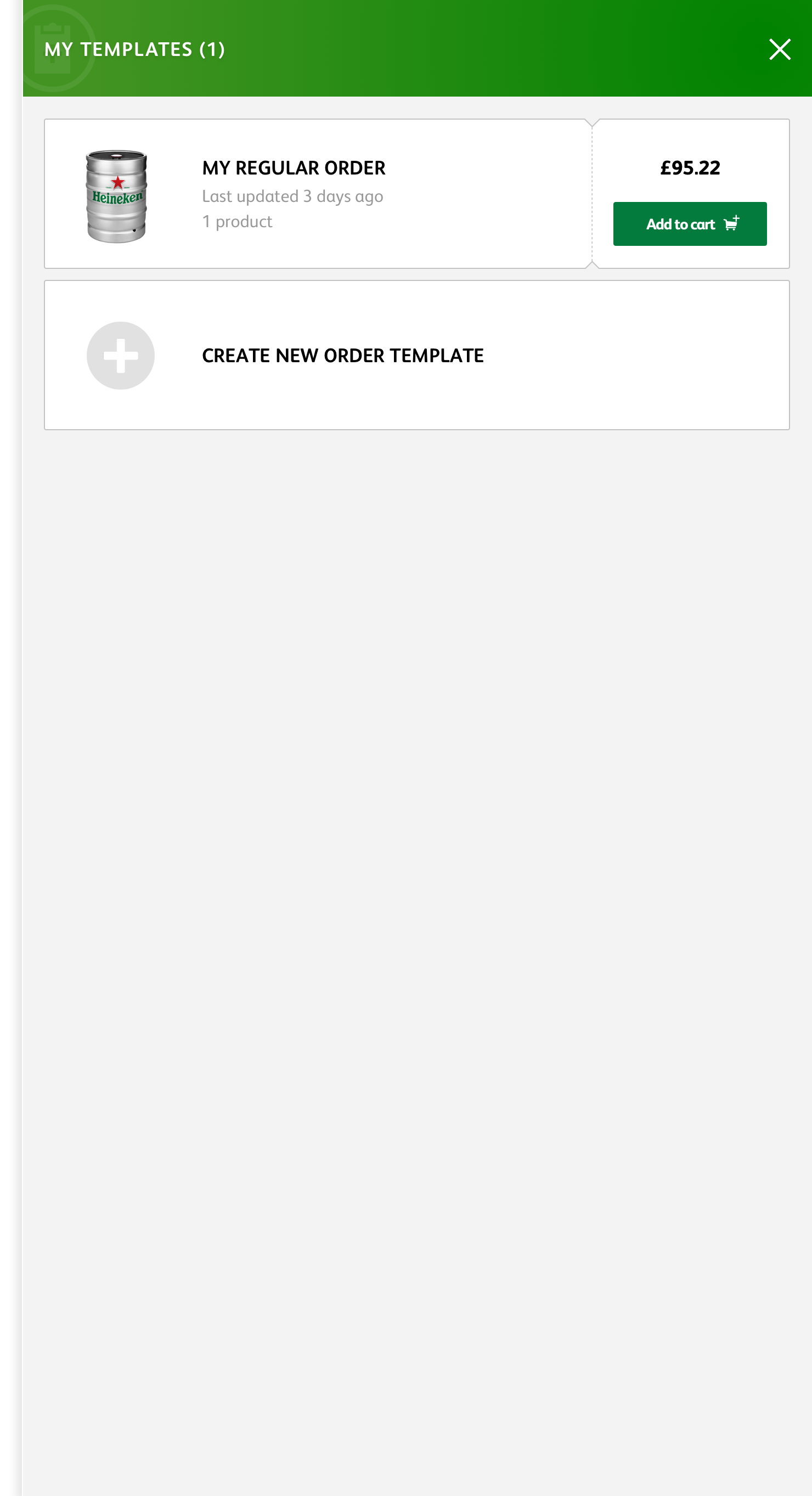
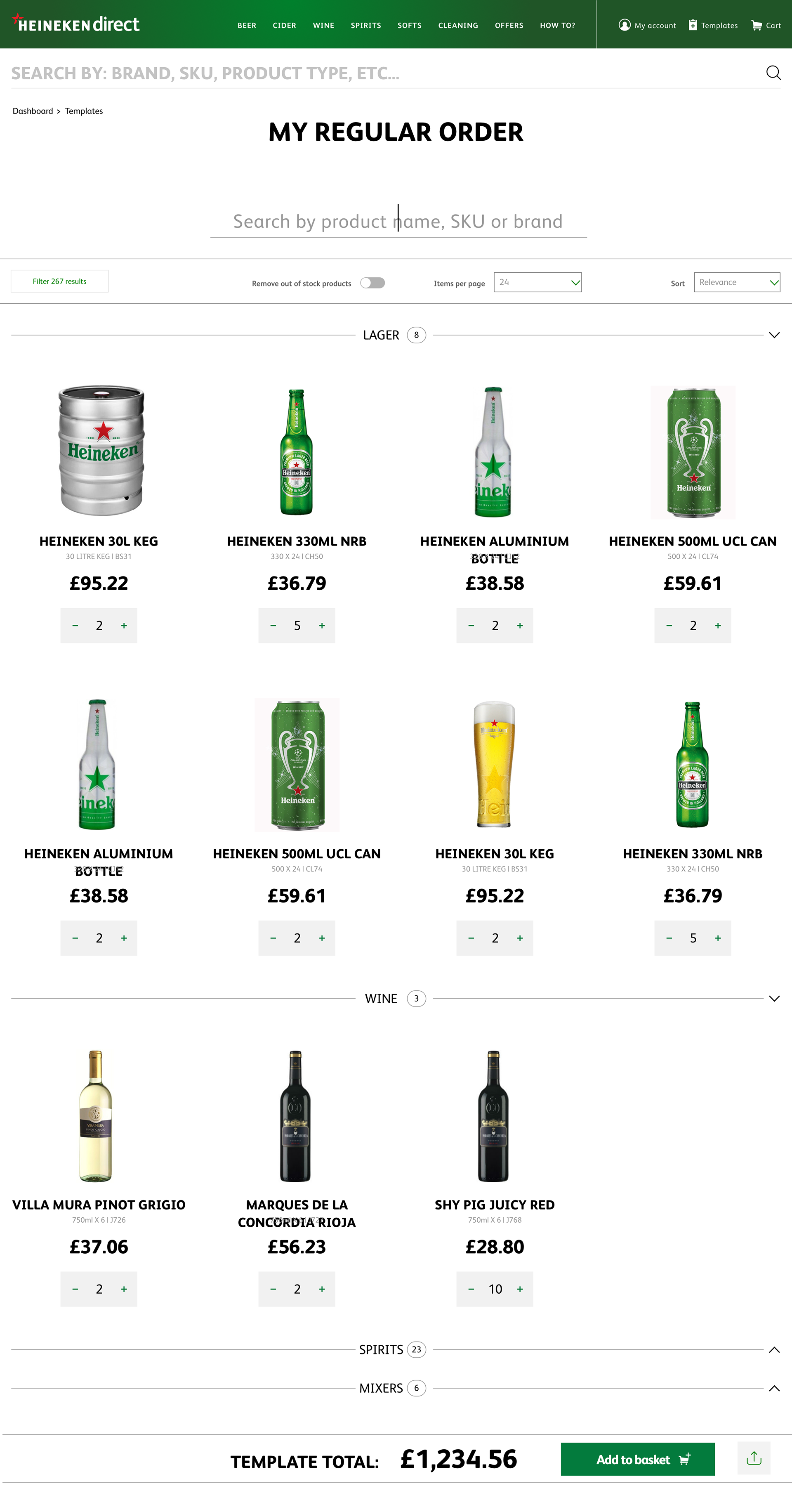
ORDER TEMPLATE
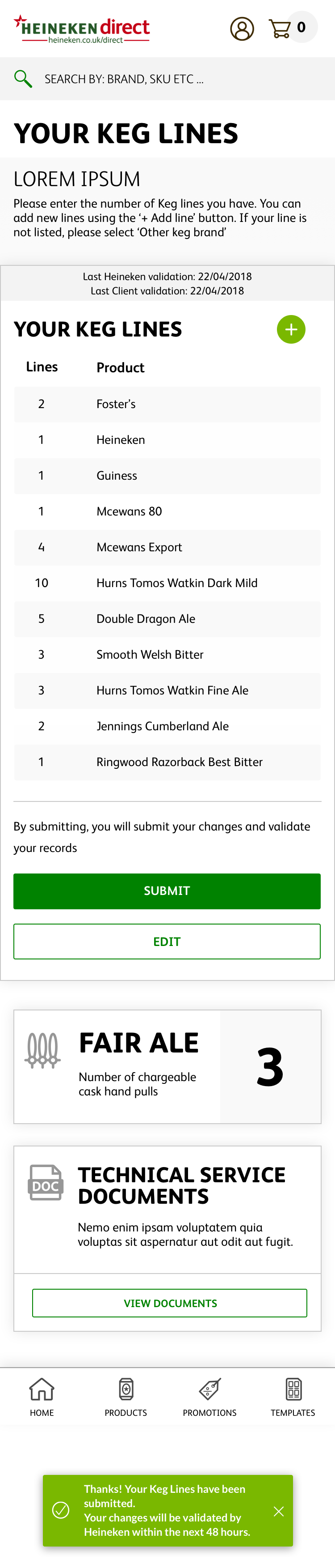
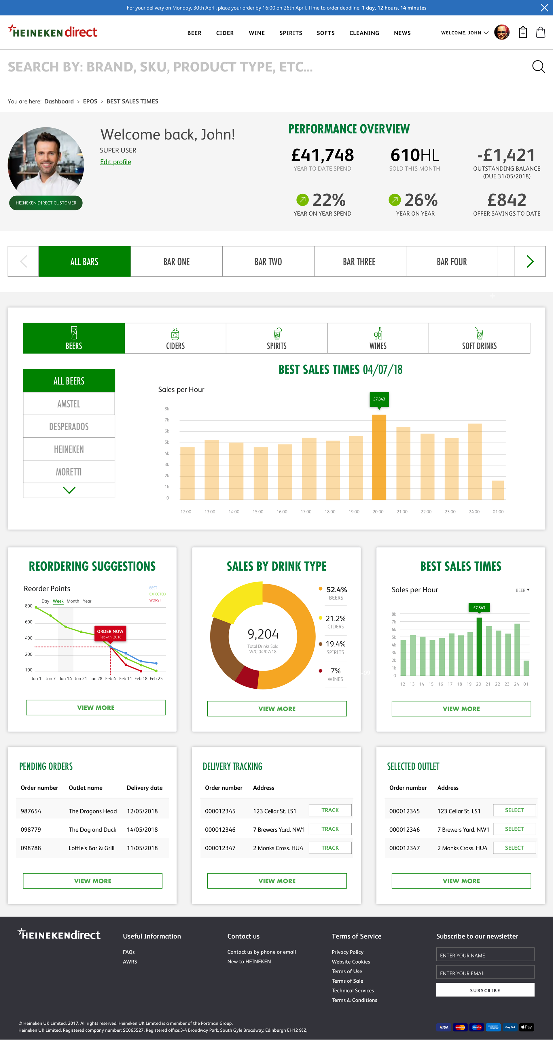
Order Templates expedite the purchase journey by allowing users to create shopping lists based on frequently purchased items or seasonal items. By automatically grouping all the users regularly purchased items averaged over a 12 week period we are able to predict their weekly order and suggest alternative or complimentary products. Guiding the user though the creation of their first template provides a positive FTUX. Grouping products by category simplifies the user journey and makes potentially long lists easy to scan. Enabling the sharing of templates allows time-poor users to review order templates on the go.
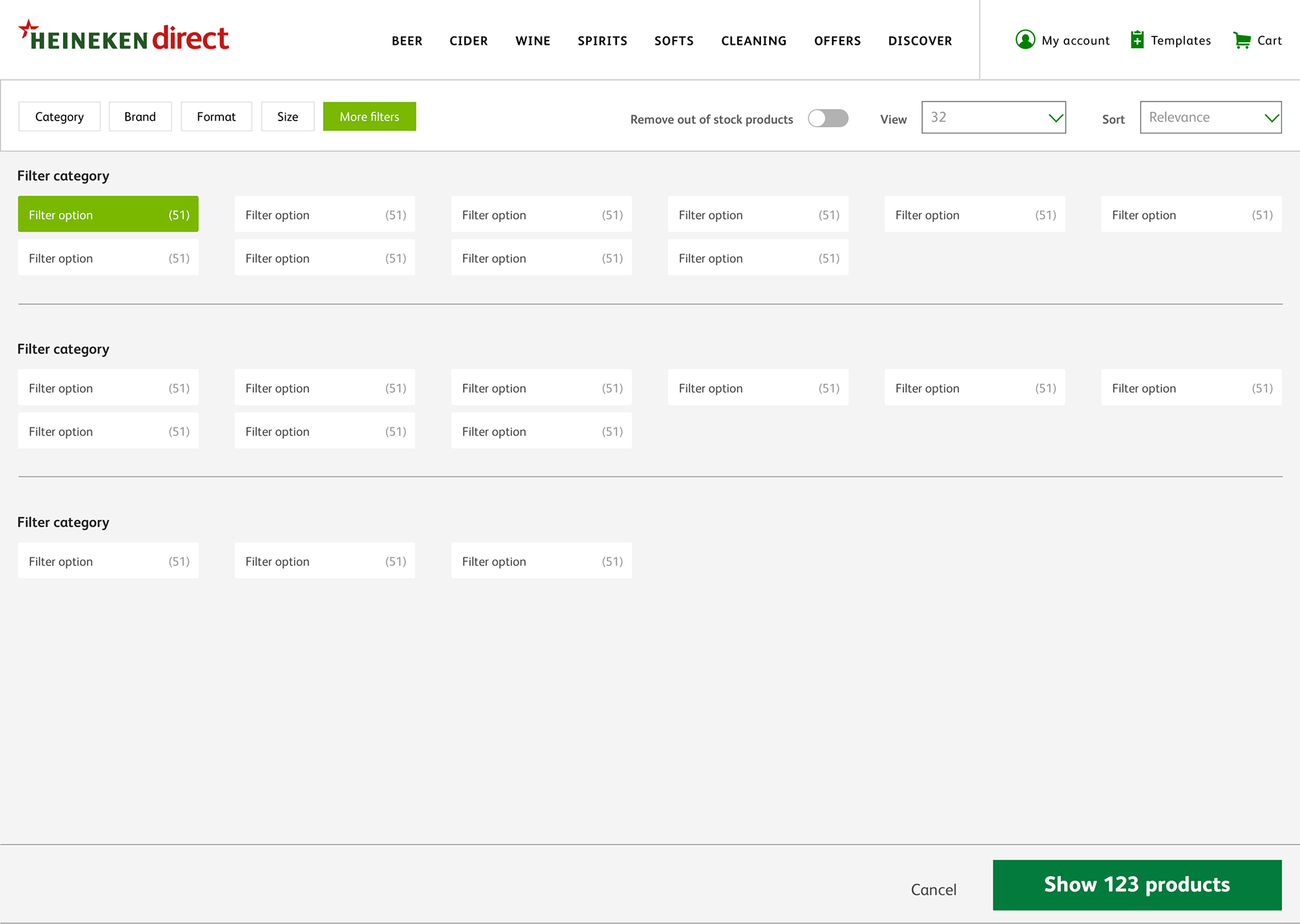
Product list page
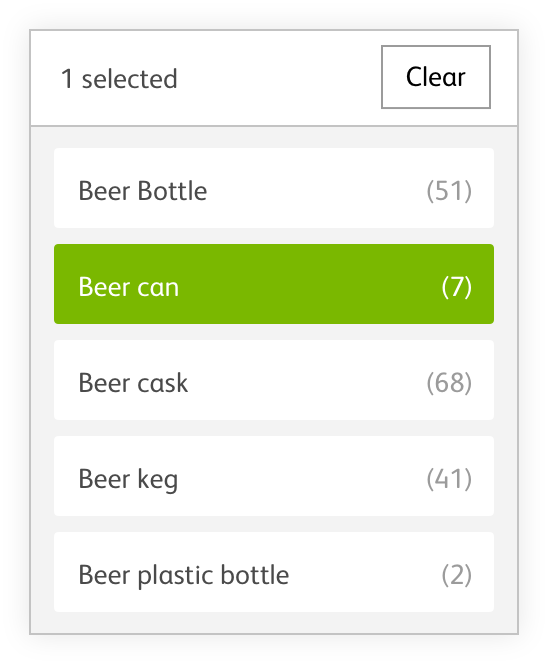
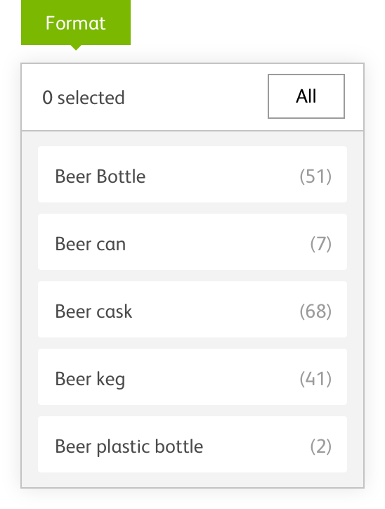
Making the UI as predictable as possible for the users is key to them finding our products. Adding docked horizontal filter will simplify this process and remove friction.
Implementing traditional eCommerce product cardsreduces the space needed to display products and delivers the simplicity and ease of usewe all crave when shopping online.
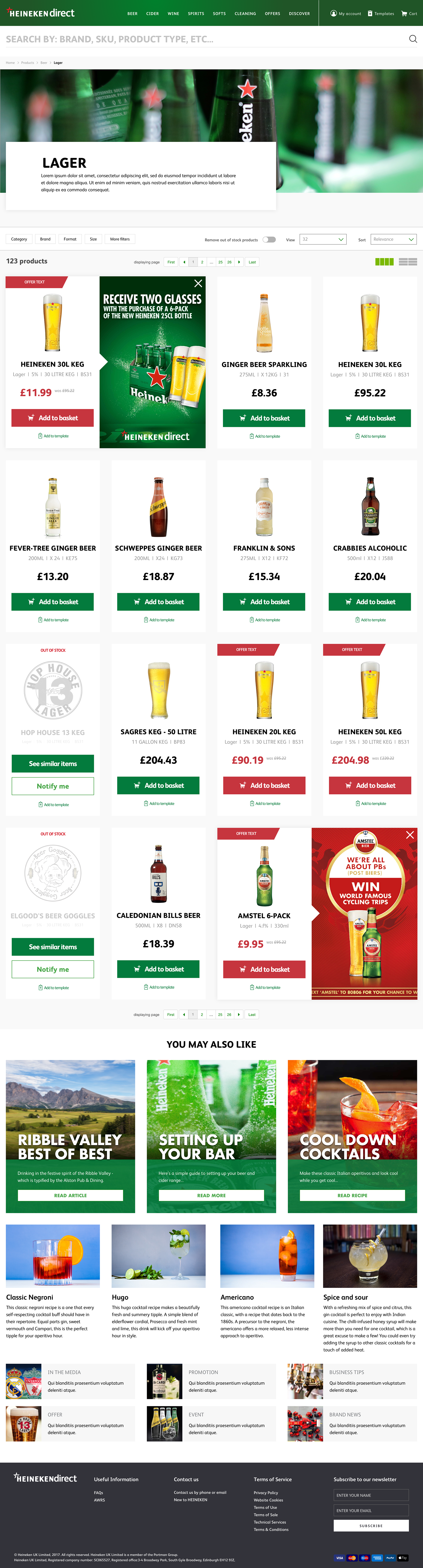
Product list page
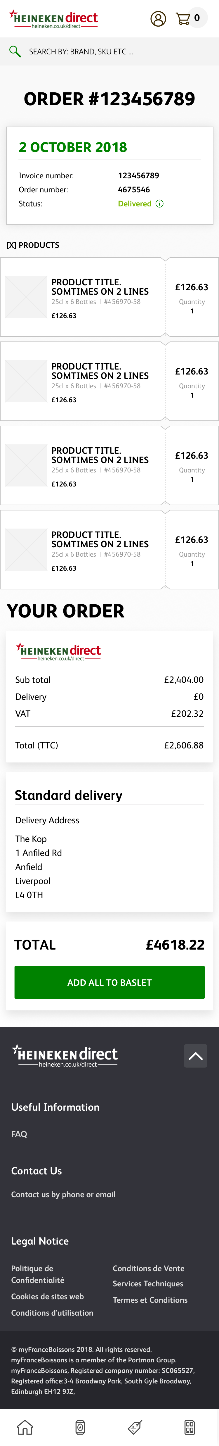
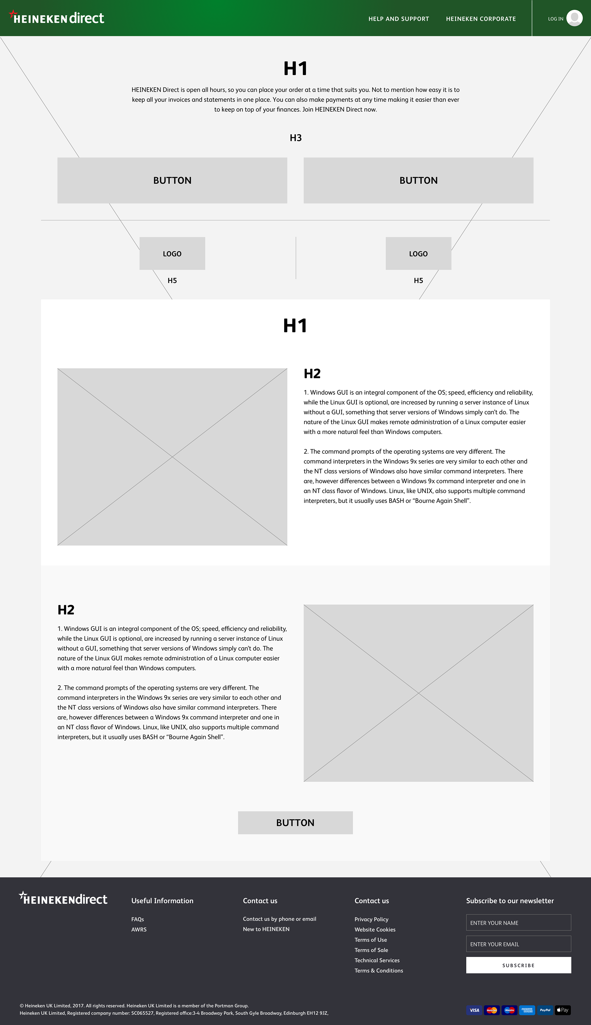
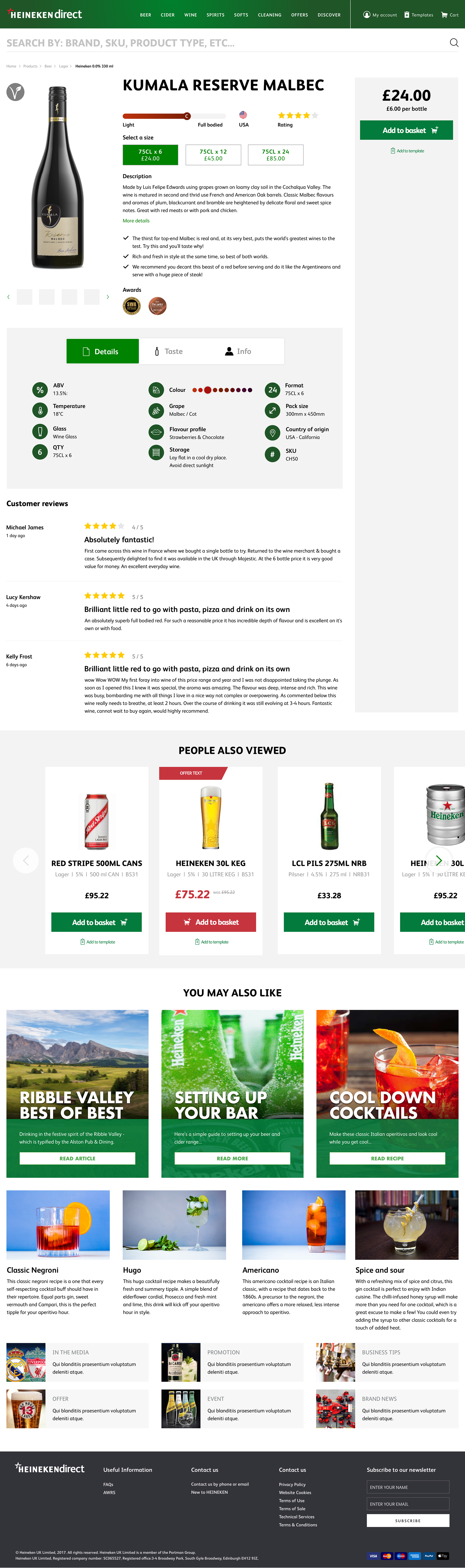
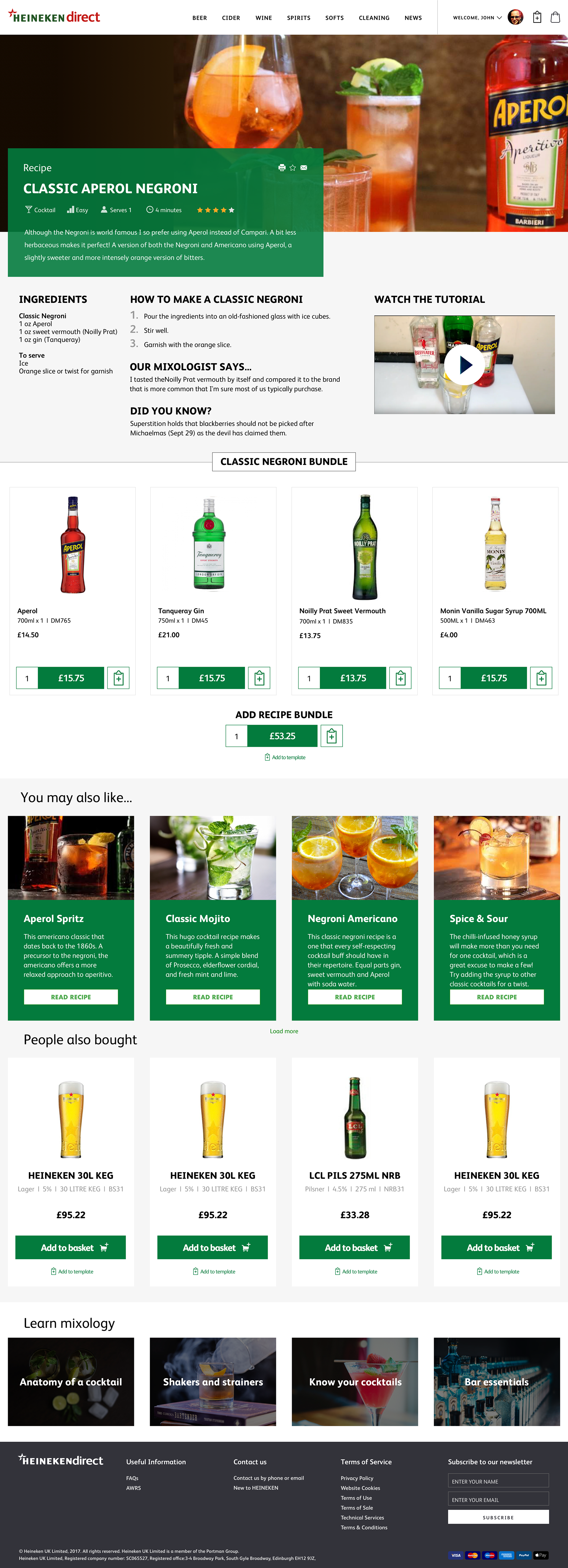
PRODUCT DETAIL PAGE
A clear and clutter free layout helps the user find digest the content that matters and eases the decision making process. An always-visible price and CTA means the user never has to scroll to add the product to their basket or template. Cross-Sells & Cross-Navigation are a substantial part of the product page experience. Allow users easy access to the parent category not just adjacent products is key.
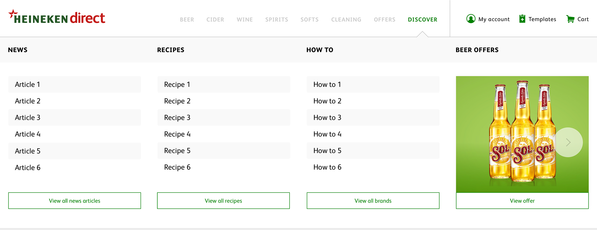
More desktop examples


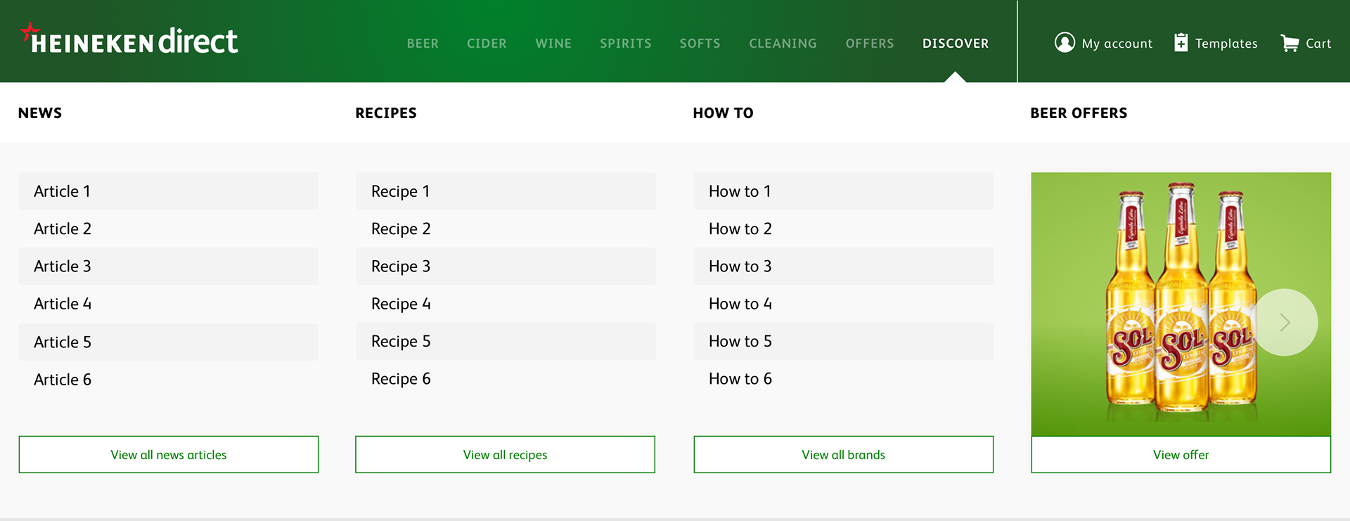
Mobile examples